
МІЦЬ — Ukrainian for might or strength — is the brand name. The premise: take Artemsil, the historic salt works in Soledar (Donetsk region), and imagine the campaign it would run if it leaned hard into its industrial roots. Rock salt as a symbol of endurance, not a kitchen commodity.
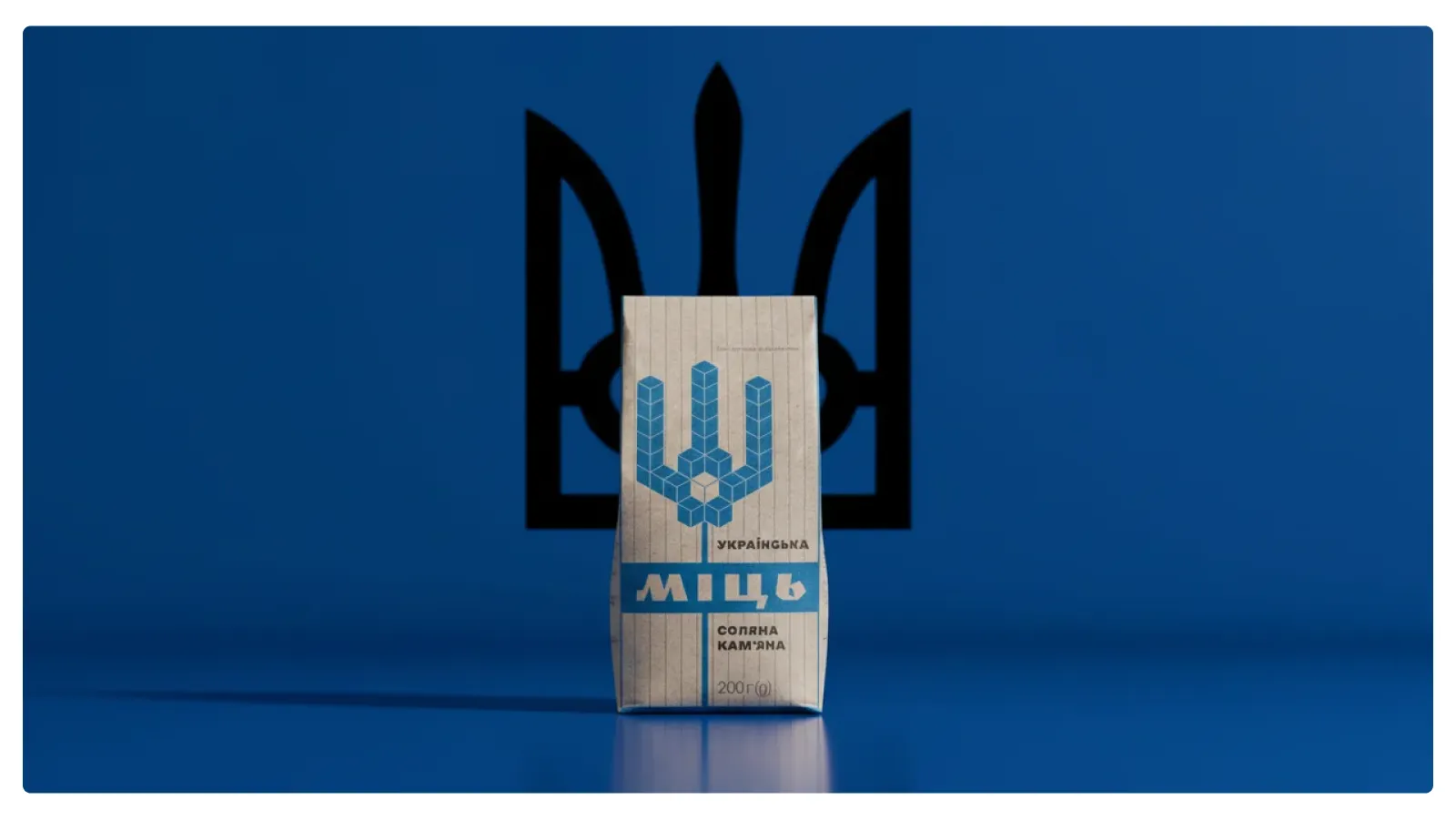
Every frame is built from the same set of ingredients: high-contrast lighting, near-monochrome deep blue, the trident as silhouette, paper packaging weathered by salt. The visual rules are tight on purpose — repetition reads as identity.
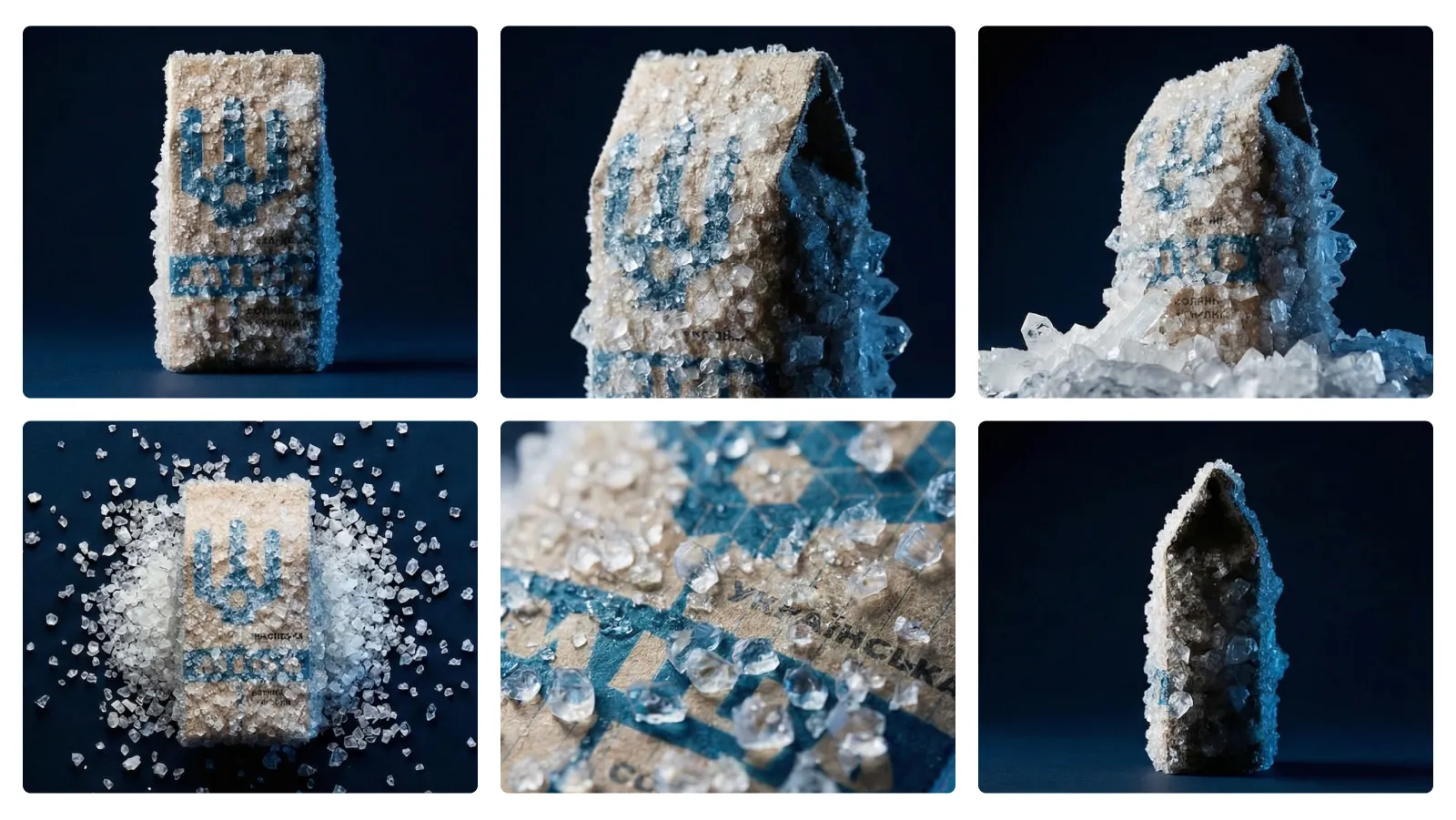
Sound design is sparse and intentional. Camera moves are deliberate and slow; edits land on impact. The pack itself does most of the talking — set against historical scenes, mineral textures, and the people who carry the same heritage forward.
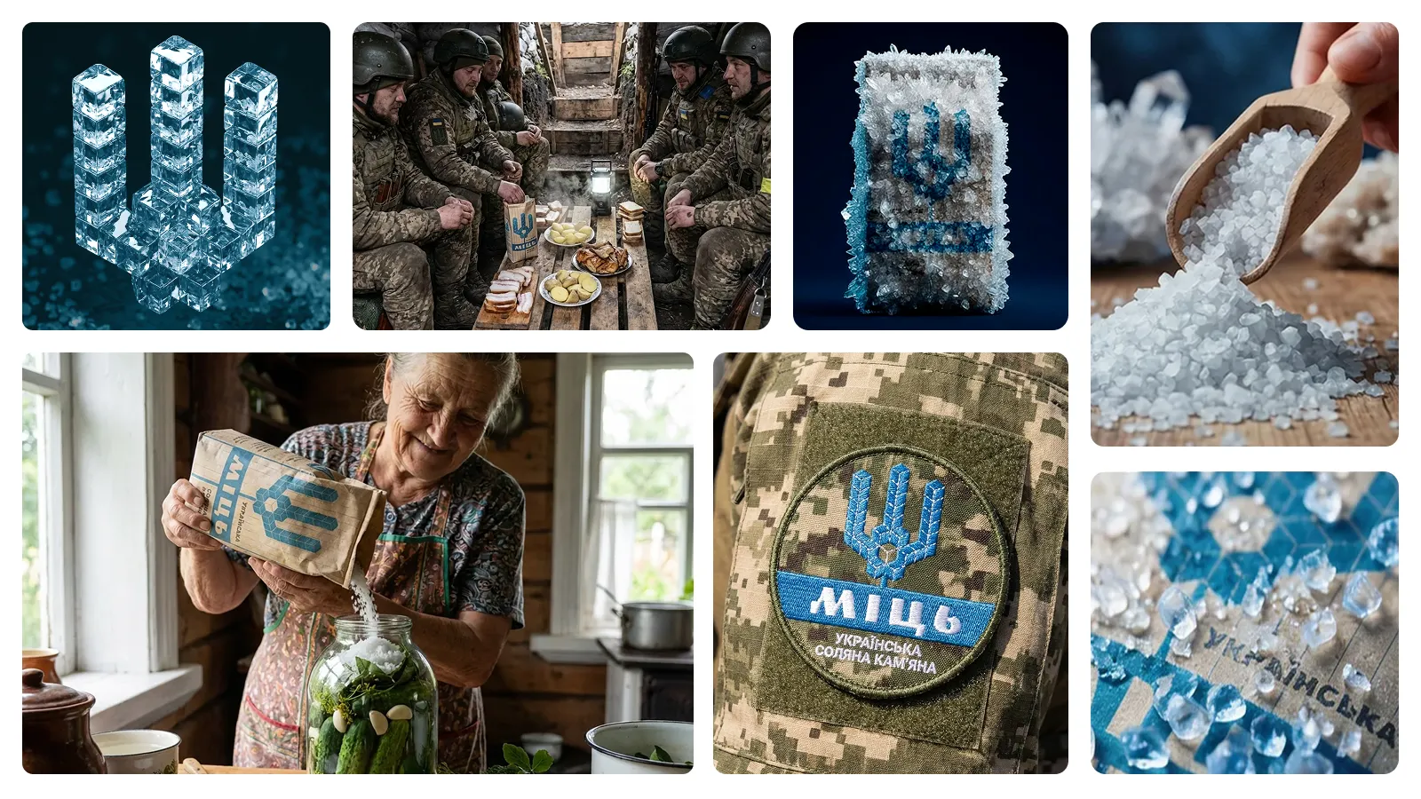
A conceptual, non-commercial portfolio piece. All stills and the film were generated with AI tools as part of an experimental creative process — combining brand strategy, storytelling and generative design. Not affiliated with Artemsil and not used for commercial purposes. Original packaging design by Artem Gusev.