
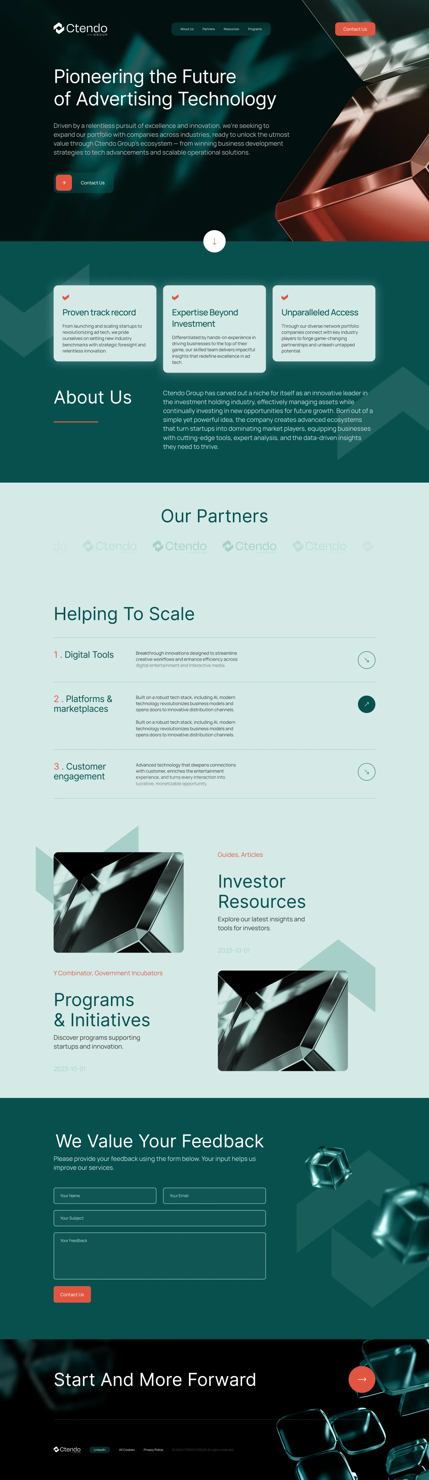
Ctendo Group is an advertising technology company. The brief asked for a serious, modern identity that could carry equal weight in two registers — a confident orange that gets attention, and a deep green that feels institutional. We delivered both in one book.
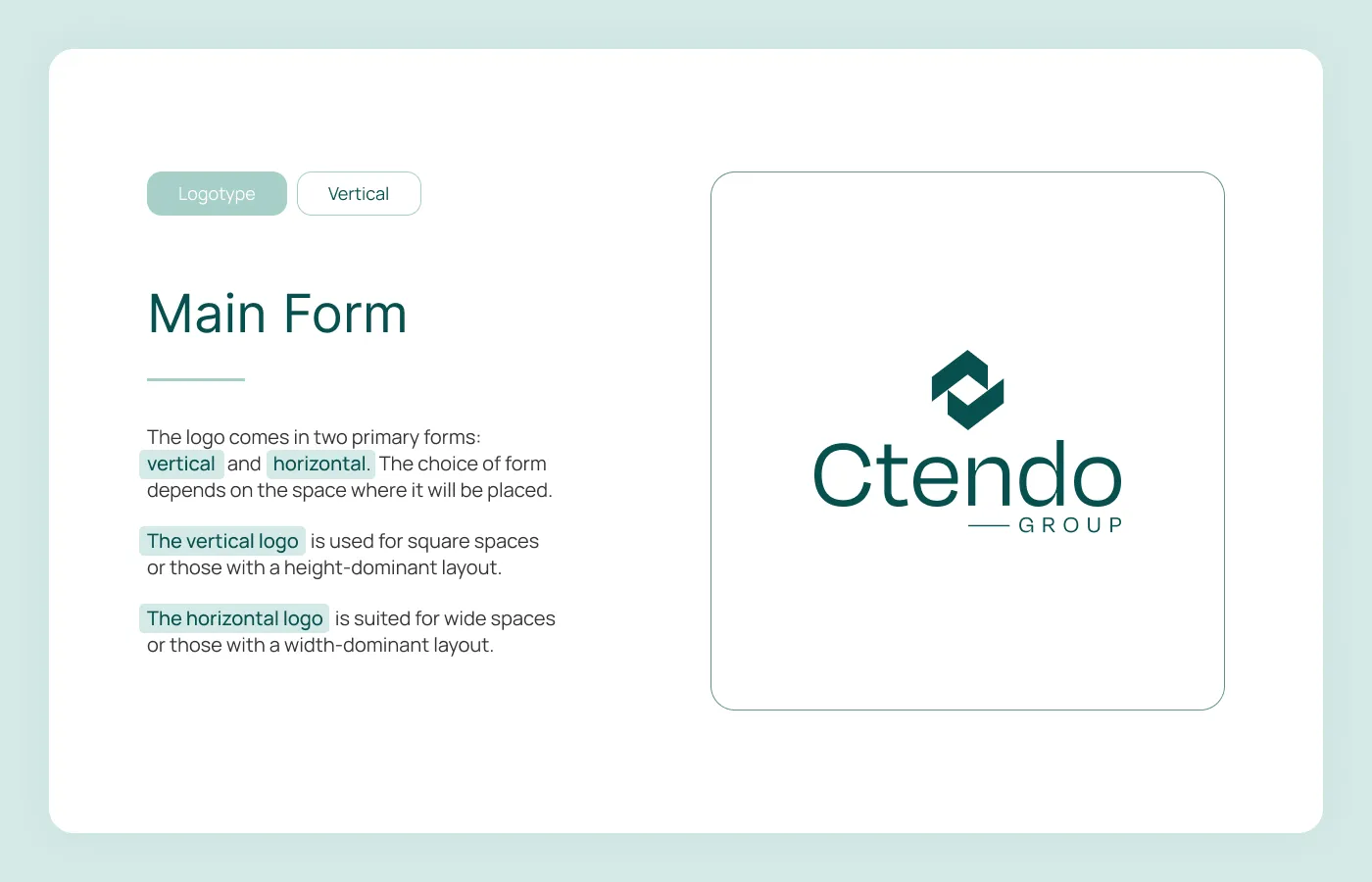
The wordmark pairs a stacked hexagonal symbol with a bespoke "Ctendo" lettermark and a "GROUP" sub-label. It works vertically for square spaces, horizontally for wide ones — both are first-class, neither is an afterthought.
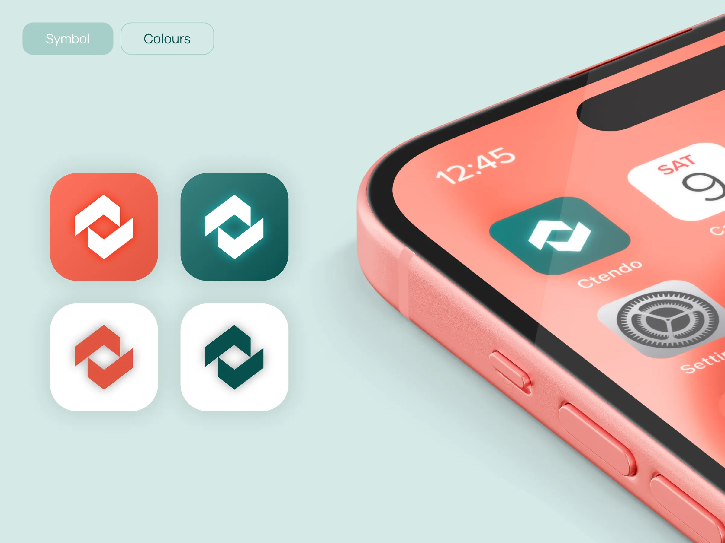
Colour variants. The system carries four primary logo treatments per orientation — orange ground, green ground, light ground, and an inverted set. Each variant has a defined background, never a free-floating mark.
Mono lockups are reserved for single-colour print, embossing, and any context where colour can’t be trusted. They keep the same proportions as the colour versions — the only difference is the absence of colour itself.
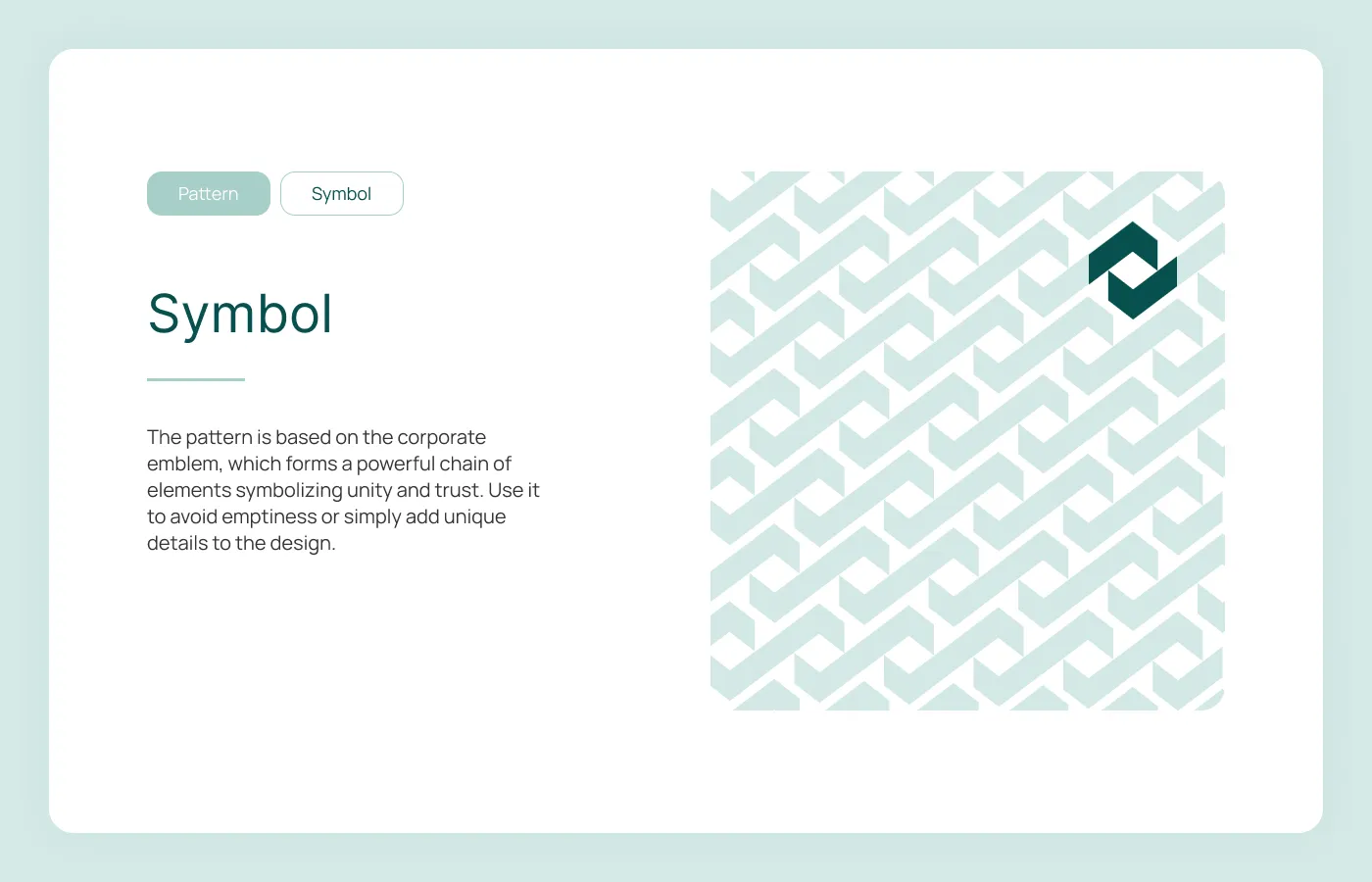
The pattern is generated from the corporate symbol itself — a chain of repeating hexagons that reads as unity and trust. It’s designed to fill backgrounds without competing with the wordmark.
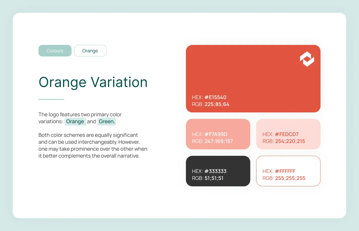
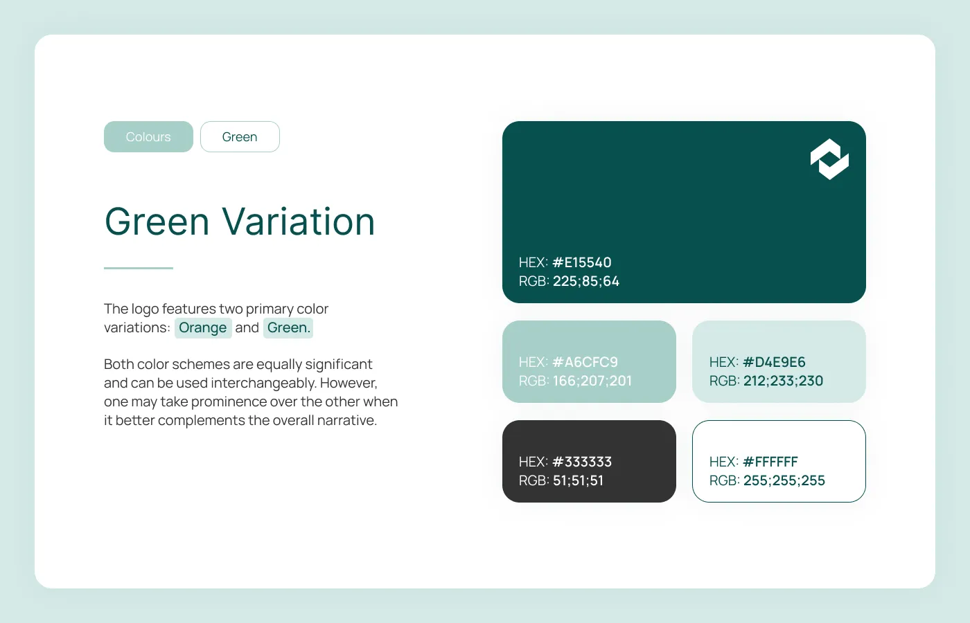
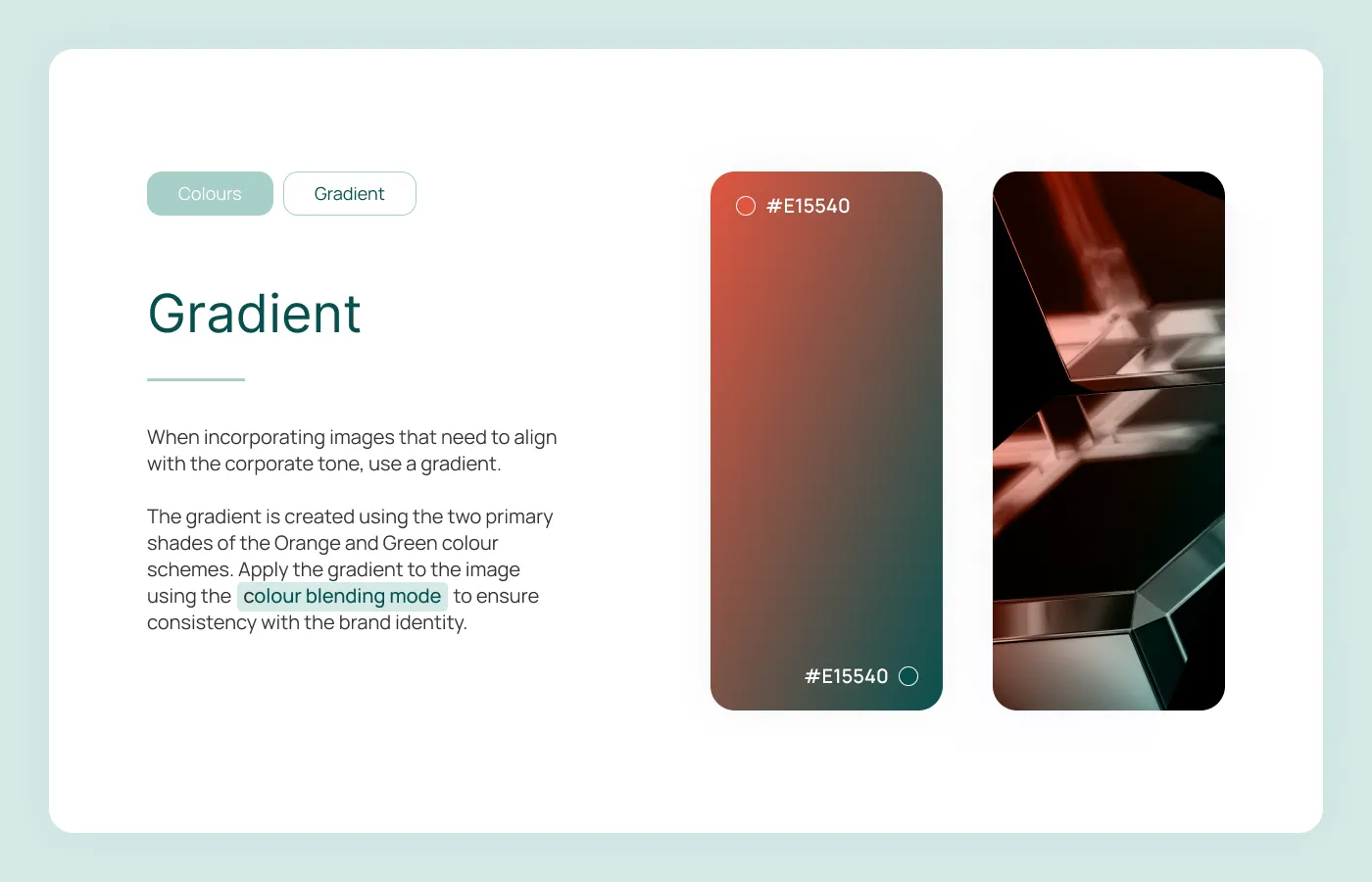
Two parallel colour palettes. The orange route is louder, used for outward-facing campaigns; the green route is quieter, used for investor material and long-form documents. Both share the same neutrals.
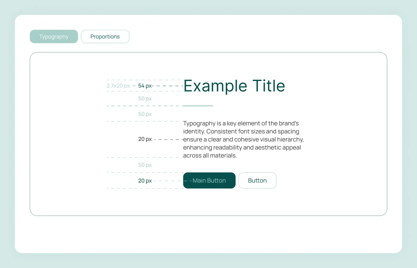
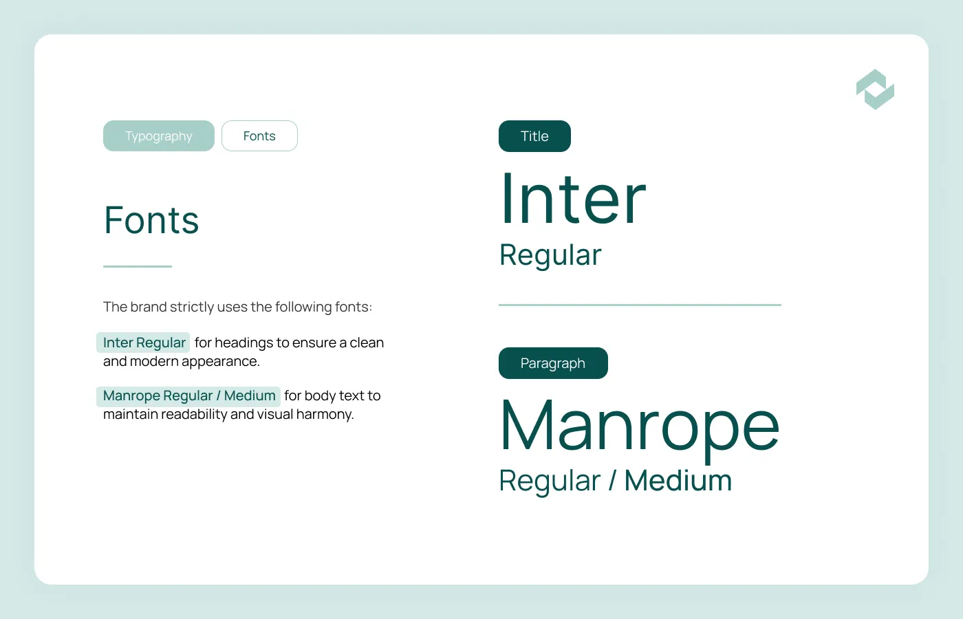
Typography. Inter for headings — clean, modern, neutral. Manrope for body — softer, more readable at length. A proportional grid (54/50/20/50/20) governs spacing so every block of text sits inside the same rhythm.
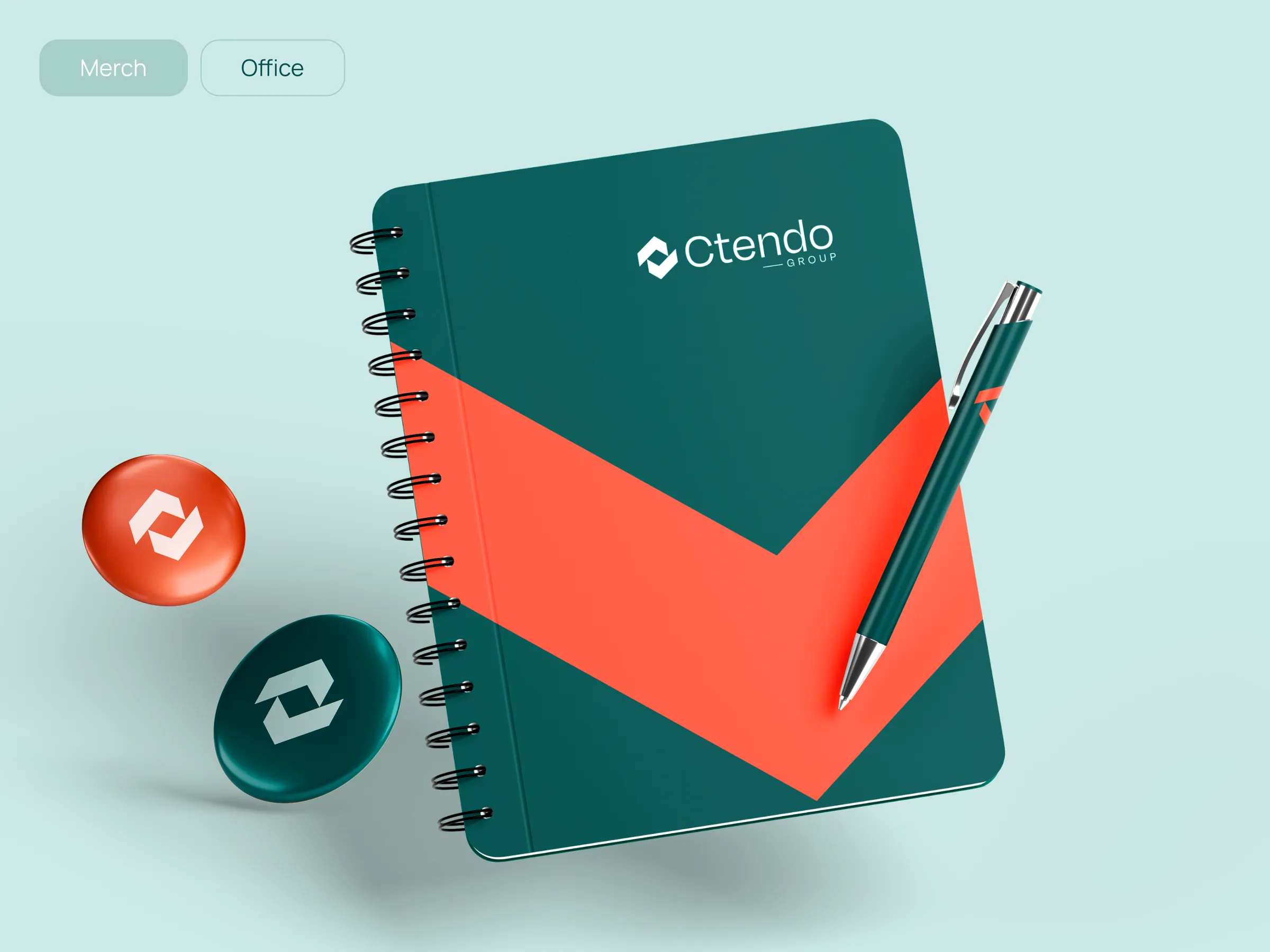
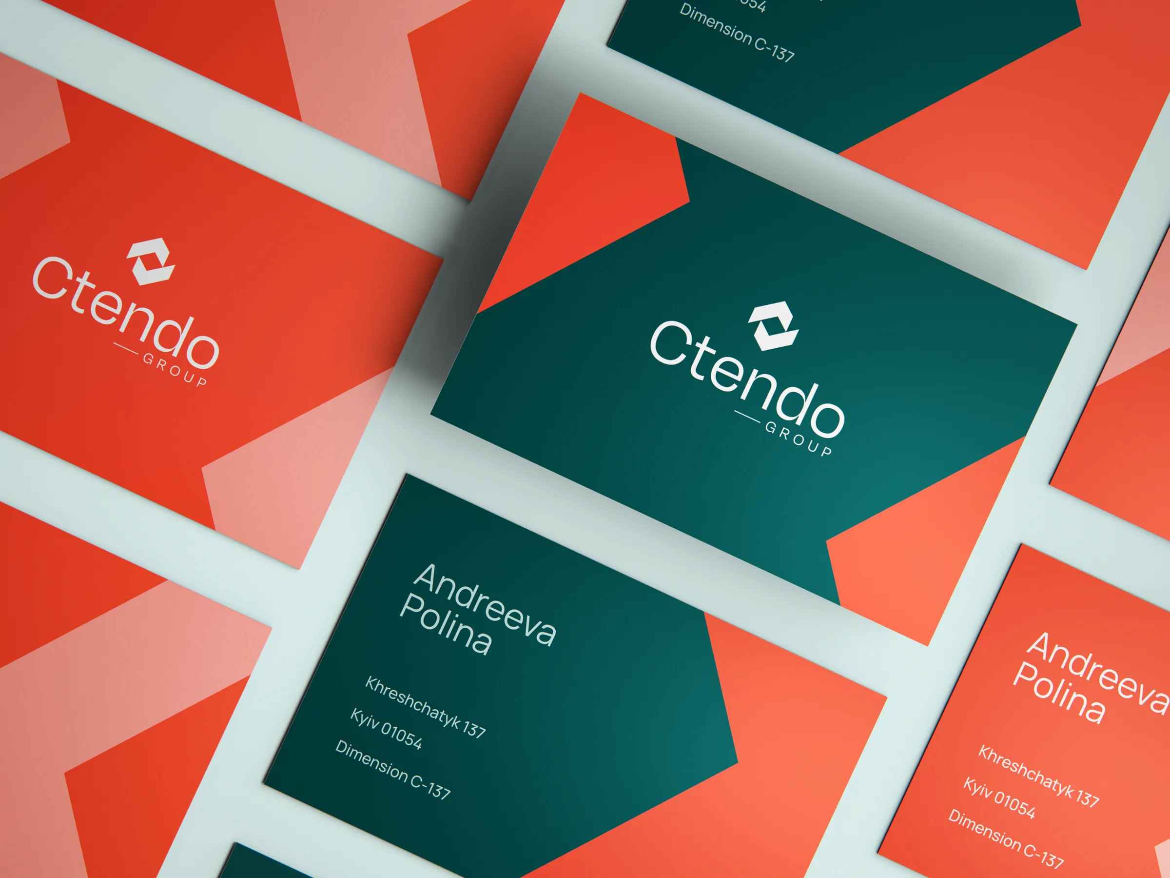
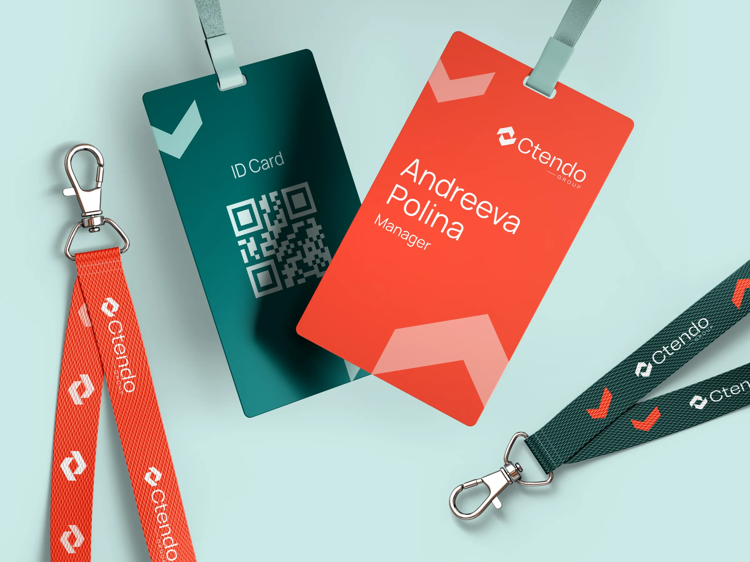
Applications. The system was stress-tested across a full set of touchpoints — app icons, stationery, merch, and printed identity. Each surface uses the same rules, only the medium changes.